From massive companies to up-start bloggers, we all rely on a decent-looking website. These days even the least tech-savvy Luddite wouldn’t trust some site that looks like a mid-tier GeoCities page (ask your grandparents). Presentation matters immensely online. It can make or break UX, entice customers, and establish a unique brand look and feel. That’s why, for this article, we’re looking at the most innovative examples of Web Design making the rounds this year.
While the visual quality of these designs might seem subjective, the purpose of this article is not to sway you on whether these are the best-looking techniques. They are a) trends worth noting and b) useful for illustrating a crucial point: how to use these techniques to enhance functionality. For that reason, the main commentary in this article will deal with the function of these elements rather than the look.
Mostly, we’ll be looking at visual components that add value to your site, especially multimedia techniques. Hopefully, the average reader can also take these and implement them into their own marketing operations. Whether you’re a freelance web designer or working for an established firm, we hope to at least provide some food for thought or ideas you can take to a professional designer.
Tech Minimalism is Out
Tech companies have been dipping into minimalism as an easy shorthand for their brand logos and web design. However, as research shows, this is quickly going out of style. The average consumer finds minimalism in logos counter-productive as it obfuscates the purpose of the company. An abstract shape tells us nothing about what the firm offers or is trying to sell us.
Over time, we’ve been seeing increasing minimalism in the logos for big tech companies, from Twitter to Instagram. Theoretically, this is a natural extension of the ubiquity of a lot of these companies in our daily lives. We’ve become so familiar with them that the mere outlines of their logos are recognisable. It’s a power move to infer that your logo is so ingrained in people’s memories you can simplify it to its bare components.
Minimalism can, however, go wrong. A bad example of this is Google’s recent slate of re-designs for the G-suite in Gmail:
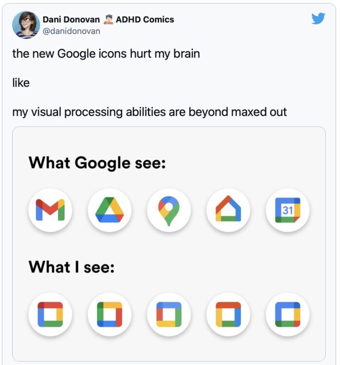
The reason the new designs don’t work quite as well is that they eschew utility in favour of branding. As designers, they were more privy to universalizing the colour scheme and minimising the shapes than maintaining the symbolic meaning the icons used to have.
Retro Web Design Elements
“The old is new”, as the old adage goes (if you’ve never heard that, it especially proves my point). Web design is not averse to the deep-sunken claws of nostalgia or nostalgic designs reinterpreted with modern lenses. Currently, there is an entire generation of digital natives that have fond recollections of retro-tech and the “vintage Internet”.
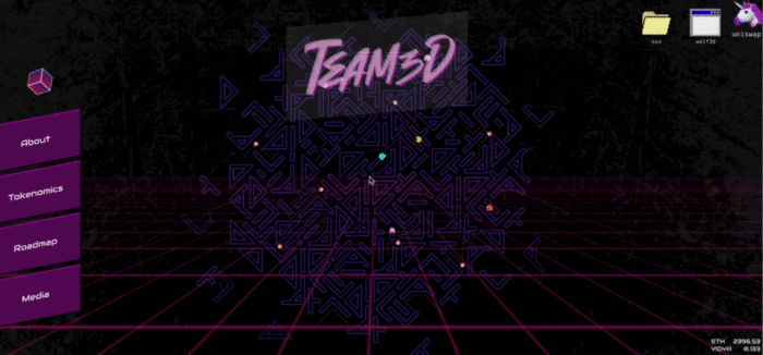
The website for Team3D is quite something in this regard. It features a smorgasbord of old-school design flavours: bright 80’s colour schemes, cyber-grids, old-school GUI components on the top right, bright pink graffiti, and big, clunky, pink interface buttons. Without being intrusive, they manage to put in a fair share of animation on the page, which adds more flavour to the retro stylings.
While Team3D’s website goes all-in on the retro, it can be a bit in-your-face for some people. There are, however, subtler ways to go about it like our next example:
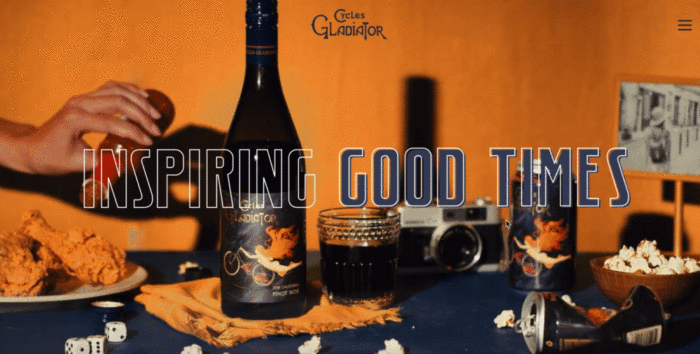
Cycles Gladiator has a pretty neat front-end that opens up with a background animation of people eating at a table. The trick is that the camera framing is squared in on the bottle of wine, which is what the company provides. Scroll below that, and the retro website layout kicks in: the page has a fade like a worn-out postcard, the first picture and video have that subdued Polaroid look to them, and the fonts have an old-school bevelling with soothing colours.
Also, while it is plainer than the previous example it never feels empty due to little flourishes like the squiggly line in the middle section. The font transparency also lets the pictures breathe and every color matches the mood. It’s proof that you don’t have to go all-out to establish identity. Sometimes less is more.
Both sites invoke feelings of old memories or classic aesthetics while putting a modern twist on them. There are numerous design styles to choose from but it’s important to make it feel classic without feeling dated.
3D Web Design & Animation
Every professional website designer can appreciate a well-done depth effect. A 3D website layout design can be cumbersome to pull off but it adds a lot of visual flairs. It can also make use of space is useful ways, where objects can be spread apart with depth, leaving room for more vertical and horizontal information.
The Museum of Annoying Experiences is fantastic for this very reason:
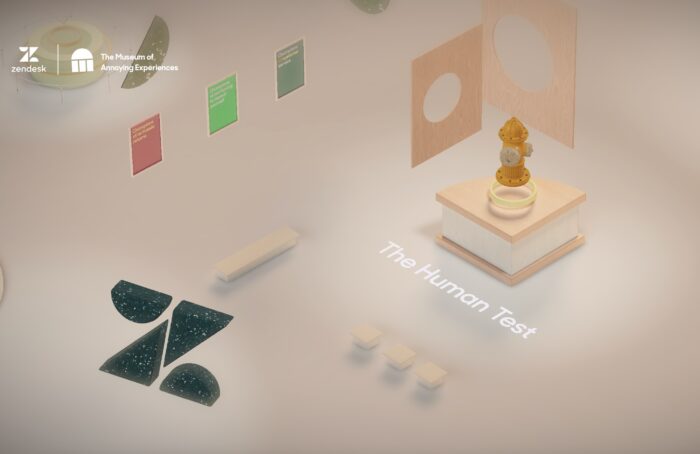
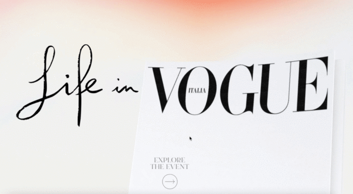
This humorous ZenDesk website acts as a digital tour of a museum showcasing the copious annoyances of the Internet. It uses the effect to engage the viewer, like a browser game. Life in Vogue does something similar with its page-turning mechanism, smoothly going from page-flipping to entering an elevator. It’s very engrossing and a great way to lead the viewer through the website.
Although not all 3D effects need to be this overt. Some can be flashy without going the whole 9 yards while offering something enticing for the senses.
Mix & Match Multimedia With Horizontal & Vertical Scrolling
Every company makes use of website multimedia features, often lopping together 3 or 4 types of media on one page. However, such features can make everything feel cluttered if designers don’t proceed with caution. There are ways to make this more natural by using alternative scrolling formats and not just keeping it vertical.
One of the techniques in web designing for multimedia gaining more prominence is horizontal scrolling. While it’s been around for a long time, it’s taking off more and more in recent years, with quite a few good examples. Probably the main reason for this is how much it improves navigation via phone. Horizontal elements mixed with vertical ones let you optimise space especially if you have a lot of categories to convey to the user.
Another example from Life in Vogue (seriously, this is a good website) comes in their Postcard sections:
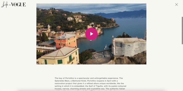
The page transitions from vertical text to horizontal image scrolling quite easily. This economises page space and lets users easily navigate the slideshow carousel. It’s an engaging alternative to constantly scrolling lower and is certainly better than dotting the pictures around the article. It also fits with the kinetic nature of the rest of the site.
It helps ground all the parts of a website layout with their own specific motions that match their purposes. They don’t have to be on the same page either. When one page is vertical scrolling and another is horizontal, it can give each its own identity. One can have more of a slideshow feel while the other can read like a standard webpage.
UI/UX designer Ben Hamilton’s personal page does this quite well, embodying his quirky design sense for potential clients to see:
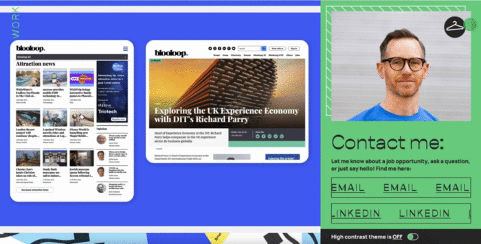
His case study plays out like a carousel while the main page is vertical. It fits the purpose of the website, which is to show off his design chops. It also provides nice use of the website grid, with one frame staying static (his contact info), while others move about. Sidenote: bonus points for including an option to toggle high contrast mode.
AR Web Design
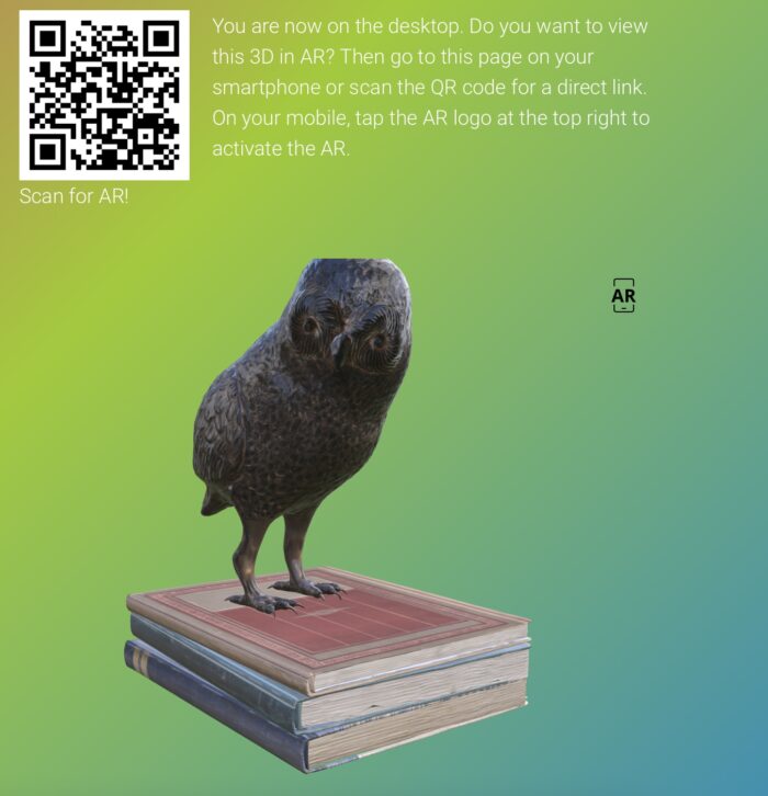
Speaking of multimedia features, AR website design has a lot of untapped possibilities one could. It might be on the gimmicky side right now, but I see it as having a future if applied correctly. It is one of the new techniques in web designing, so its potential can be hard to gauge.
Integrating QR codes that the user can scan lets them access portions of the website with more in-depth features:
Other companies like retail stores have used this feature to create visualisation techniques for their services:
IKEA’s app lets you imagine what their product would look like in your home. Any product on their website with the specific 3D models can be accessed in this way. It provides a new way to sell items and build customer certainty. QR codes and visualisations also make for unique forms of CTAs (call to action).
Parallax Scrolling
Parallax scrolling adds a staggering range of motion to your webpages. It can be one of the best web design techniques for presenting moving visual information in an animated, unfolding manner. It works with the motion of the cursor which makes it far more engaging as the site evolves with the user’s journey through it.
STEEZY Studio has a pretty imaginative accordion-style expanding parallax layout for their main page:
The colours alter with the motion of the screen and the images below expand to greet the viewer. It gives a flow to the information being presented. Internet users are a jaded lot who barely process on-screen information while they scan through a site but such techniques offer a remedy. This draws the user’s attention in an optimal way while making use of space and linear motion to emphasise certain aspects.
It can be an important tool in scrollytelling, which combines all these elements to tell a compelling narrative to the reader. This could be a brand story like the one from Life in Vogue or a more individual one like Ben Hamilton’s page from earlier.
Custom Cursors & Mouse Over Effects
Custom cursors often operate within a precarious balance. Done badly, they can be an annoyance that serves no practical purpose outside of being flashy. However, even the simpler ones can have their benefits, especially when they help guide the user through the website.
A good, yet quaint example is Fontsmith, who make the cursor semi-transparent so the reader can move around the various font types on the website, represented as blocks. The cursor doesn’t obscure the blocks and the highlight colour mixes well with the background. It helps the viewer home in on the fonts they highlight, some of which can have very subtle differences.
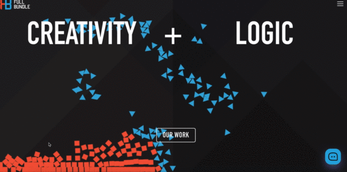
Full Bundle and Made in Haus.com also have creative mouse-over effects that are pure eye candy. The former uses kinetic, game-like, dual-colour triangles falling and repelling in reaction to the mouse, while the latter has a subtler, kaleidoscopic lava lamp effect that shifts with your cursor. Both add a tiny bit of wow factor to the website while emphasising the creativity of these companies.
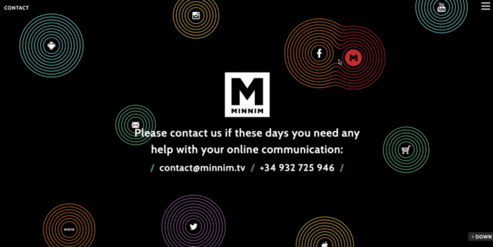
Minnim, similarly, has a mouse effect where vinyl-esque patterns follow along and mix with other similar shapes as you drag your cursor. These help highlight the contacts and platforms on their contacts page, which is one section of a website people rarely pay attention to. It helps the viewer remember the details that often seem mundane on other sites.
It serves as subtle but good marketing. The only thing missing is that I feel like those pictures could have allowed for direct hyperlinks to their social pages and contacts.
Conclusion
So there you have it. These examples make clear that web design is an art of its own, but there’s a caveat to thinking of it in aesthetic terms. Website development and design need to be, first and foremost, functional (i.e. the primary purpose of professional web design is to serve a function). This is true whether you’re using a beginner using WordPress themes or even if you’re a full-on designer.
Hopefully, these web design and development cases illustrate that you can integrate beautiful images that serve a goal and lead the audience through your webpage in a coherent fashion. They aren’t just pretty web pages, they are functional art meant to be fully responsive. If there’s any takeaway from this, it should be to serve equal parts “visual” and equal parts “design” to optimise user experience.
If you’re interested in our website development and web design services, let us know.
Aside from the featured image, All image credits go to respective websites.