
Mobile SEO Optimisation Tips in 2026
As a growing number of users ditch PCs for other devices, mobile SEO optimisation has become absolutely necessary. As more and more people use their phones as a primary search device, you may be missing out on clicks and conversions. Let’s go over which mobile SEO tips work best in 2026.
How to Optimise Websites for Mobile
Mobile vs Desktop Optimisation
While they are very similar overall, there are some core differences between seo and mobile optimisation.
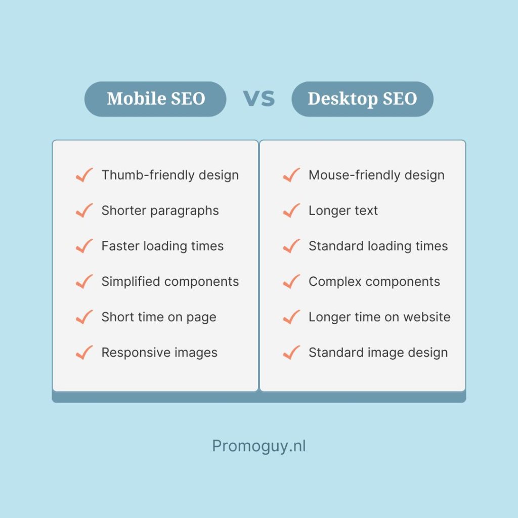
- User Habits on Different Devices can vary: People interact differently on mobile versus desktop, so tailoring your design to these patterns is key to enhancing usability.
- Mobile Habits: On phones, users act fast and spontaneously, craving quick loads, straightforward menus, and prominent CTAs. Keep mobile content short, scannable, and action-focused.
- Desktop Habits: Desktop visitors linger longer, explore more pages, and tackle in-depth tasks like form-filling or comparisons. Use bigger fonts, crisp images, and obvious CTAs for effortless browsing.
Mobile optimisation also lends unique benefits:
- Responsive designs that deliver a smooth experience on every device: Regardless of whether users visit your site via phone, tablet, or PC, a responsive design is essential. It automatically adapts your layout to fit various screen sizes and device features, creating the best possible experience for everyone.
- Mobile-optimised navigation: The smaller screens on mobiles require prioritising intuitive elements like collapsible menus, fixed headers, and buttons sized for easy tapping. These can streamline the page for readability.
- Speed and efficiency: Mobiles often deal with weaker connections and lower power, so streamline loading times and compress images for a fluid experience.
- Boosted engagement: A site that works seamlessly across devices keeps visitors around longer, lowers bounce rates, and drives interaction, aiming for uniformity no matter the platform.
Mobile-First Indexing Best Practices
Mobile-first SEO is important as Google scans a mobile version of a site’s content first. This version is crawled with the smartphone agent for indexing and ranking. As mobile-first indexing SEO practices take over, putting work into creating a responsive design, engaging in dynamic serving, or preparing separate device URLs can be crucial. Each of these has its own unique benefits:
- Responsive design: Create a responsive design by tailoring the website to multiple screen sizes and types. Allowing the same HTML code on the same URL regardless of the users’ devices can fit the content better. Google recommends responsive tables and images because they are the easiest to implement. Along with responsive design, you should set up a viewport meta tag. The viewport determines the width of the page based on the user’s device, which often looks like this <meta name=viewport content=”width=device-width, initial-scale=1”>. According to SEMRush, it’s also the best for SEO.
- Dynamic serving: Dynamic serving can operate on the same URL regardless of device. Using user-agent sniffing and the “Vary: user-agent HTTP” response header serves alternate versions of the HTML based on different devices. You can see this on websites with “m.” before the website name.
- Separate URLs: Utilising different URLs for each device is another option. This configuration relies on the user-agent and “Vary HTTP headers” as well, but it redirects users to the device-appropriate version of the site.
Similarly, here are some other tips for mobile-first indexing:
- Match mobile versions with the desktop content exactly
- Utilise the same schema markups
- Make sure the link structure is the same on both versions
- Maintain consistent headers and heading tags throughout both versions of the content
- Match the titles and meta descriptions for both versions
Mobile SEO Techniques & UX
Here are some general tips on UX improvements to boost mobile performance:
- Boost mobile page speeds
Mobile seo rankings can be heavily influenced by page speeds, even more than on desktop. Over half of mobile users will leave a site if it takes more than three seconds to load. You can optimise images and videos with a WebP format to shrink file sizes, use lazy loading to images and ads lower down your pages, and remove unused code. Similarly, loading above-the-fold content first, deferring non-essential JavaScript, and minifying HTML, CSS, and JavaScript. You can also speed up server response times by using a Content Delivery Network (CDN), caching static resources, and decreasing database queries.
- Optimise fonts
Optimise mobile sites to be more readable by enlarging fonts, using bold text, and varying the typefaces for different sections. The ideal font size for mobile reading is between 14px and 16px. Placing navigation sliders or buttons with jump links can also be handy. Keep non-critical content within accordions that expand when needed. It’s important to provide navigation options, but also, don’t clutter the page. Stick to the 4 to 6 best choices.
- Add white or negative space
Adding enough space between vertical lines as indentations can be handy. While it’s hard to predict what the screen size of the reader will be, a general rule of thumb for the average screen is that any gap between sections should be 1.5 to twice that of the space between each line. This makes the sections more visible between scrolls.
- Ensure thumb-friendly scrolling
Choose an appropriate navigation style that is thumb-friendly. Your touch targets should be about 48 pixels in size for regular ones, while interactive elements should be clearly labelled, and around 32 pixels apart. Similarly, colour-code areas with interactive so readers know to click on them.
Optimise Mobile Conversion Rates & CTR
Here are some mobile seo best practices meant to optimise mobile conversions and improves user experience:
- Mobile-friendly pop-ups
Keep your pop-ups less intrusive. Unimportant ones should not take up more than a third of the screen, or hide the content the user came for. Similarly, the more pop-ups that stop the scrolling experience, the more likely someone is to tune out. Having a good table of contents with jump links can help them navigate to the sections that they are looking for.
- Keep text brief, where possible
Shorter paragraphs take up less space on the screen and can be less imposing for the reader. Behaviourally, people don’t want their screens flooded, and this is especially true on phones where space is limited. Highlight key phrases or bold them for extra emphasis or use visuals to utilise space better.
- Keep visuals mobile-friendly
Images and videos can enhance the user experience once they are compressed or optimised for mobile. Mobile SEO requires responsive images, WebP compression, and lazy loading. Header images don’t need to take up the entire screen, either. You can also incorporate high-contrast colours to maximise impact and guide reading.
- Voice search optimisation
Voice search is crucial for mobile SEO optimisation, as it is how a large swathe of users prefer to communicate with their phones. People often use search engines with voice search, which is why certain phrases and sentence structures that are more natural to speech may need to be employed. This can be done by implementing long-tail, question-based keywords into your content. You can also include the most important information within each piece of content in or close to the first paragraph.
- Use schema and structured data
Schema and structured data provide great formatting for easy detection on search engines when they get picked up. Structured data is, thus, helpful for mobile SEO since mobile users not only get highlighted sections in search, but also ones that are finger-friendly to click on. Various elements and rich snippets, such as reviews, recipe ratings, or listings, can easily get to the top of the SERP.
Summary: Mobile SEO Checklist
Here are a few things to look out for so you can create accelerated mobile pages with SEO:

Mobile SEO Tools
Here are several tools that can help you monitor mobile SEO:
- The Google Mobile-Friendly Test: An easy-to-use tool that illustrates how well your website performs on mobile devices. Its simple interface and direct feedback features provide a good health check-up for your website. You can enter your URL you’ll receive a report on how mobile-friendly your site is. It also gives you specific, actionable points of improvement.
- Merkle’s Mobile-First Index Tool: A free resource for testing mobile-first indexing. It can compare the desktop version with the mobile version, which is essential for ensuring consistency and optimal performance. The comparison is detailed and outlines the discrepancies in content and structure. It can compare crucial elements like metadata and internal links and score them.
- Mobile SERP Test by MobileMoxie: A SEO tool for deeper insights pertaining to website appearance in search results on mobile devices. It can simulate the mobile SERP on various smartphones and tablets, eschewing the need for multiple devices. You can also simulate SERPs for various locations so you can test your targeting audiences in specific regions, which is particularly great for mobile optimisation for local SEO.
Additionally, here are some tools for specific functionalities:
- Structured Data Markup Helper: The structured data markup tool created by Google is a great method for testing and validating your structured data. It will let you know if it was implemented correctly when you enter a URL or paste raw HTML code.
It can analyse structured data in JSON-LD, Microdata, and RDFa formats. It can provide a preview of featured snippets and show how structured data might look. It can also produce JSON-LD that you can implement directly or download. - PageSpeed Insights: Great for the speed of your website. It can provide a score for your page’s speed on both mobile and desktop environments and offer detailed guidelines on how to improve your page speed. It will tell you when you need to minimise code, leverage browser caching, and optimise images.
- Google Search Console: Ultimately, you don’t need to reinvent the wheel when an old classic works fine. Use GSC for monitoring, maintaining, and troubleshooting your site’s search performance. It’s mobile SEO applications come in handy with the mobile usability reports and performance data.
If you’re wondering how to mobile-optimise a website, we can help with that. We provide mobile SEO services along with much more.